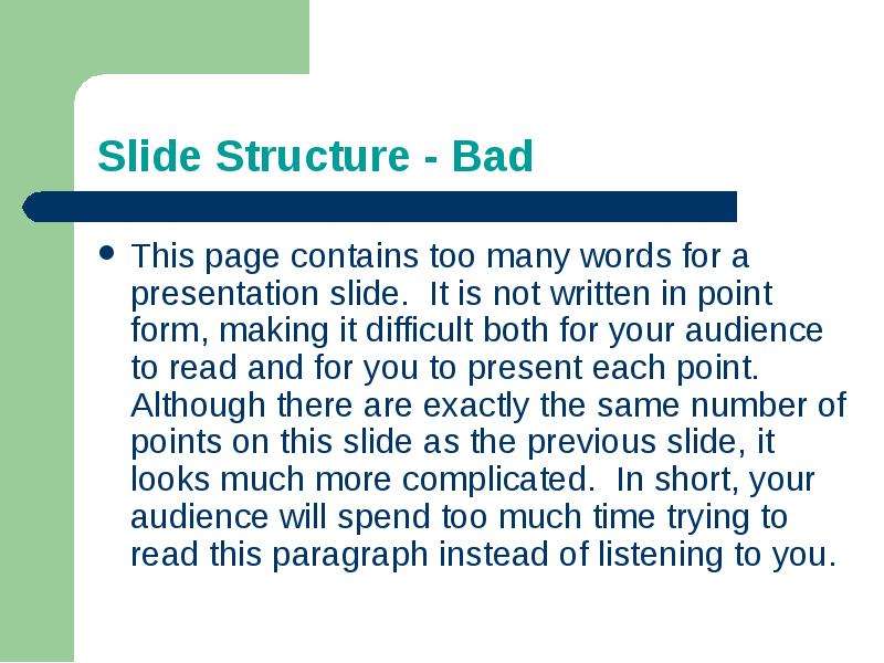
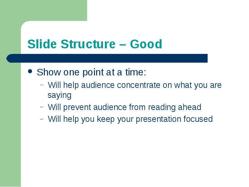
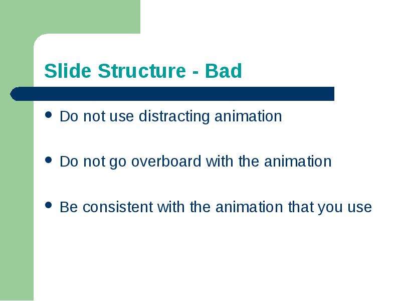
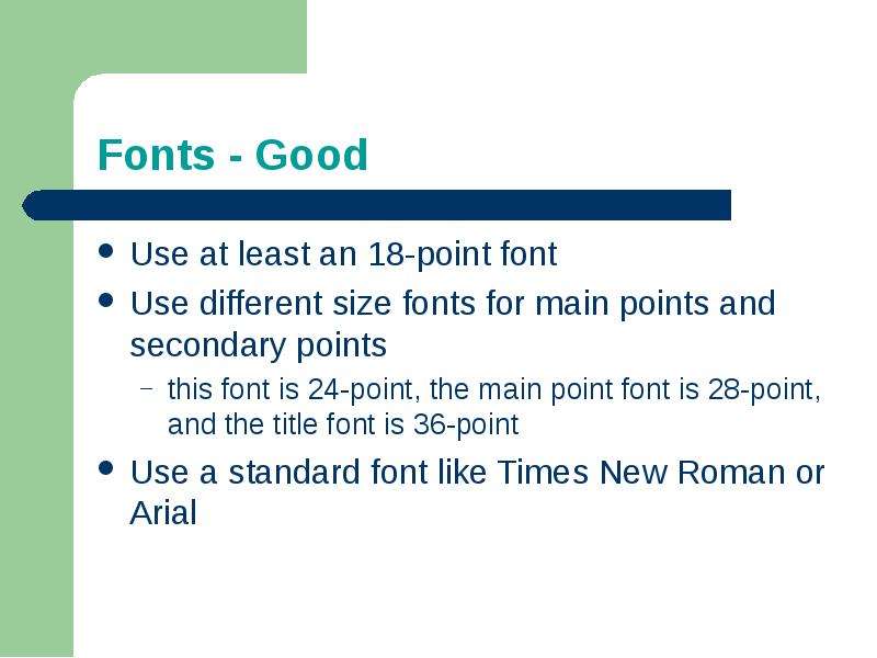
🗊Making PowerPoint Slides Avoiding the Pitfalls of Bad Slides

Категория: Английский язык
Нажмите для полного просмотра!
Making PowerPoint Slides  Avoiding the Pitfalls of Bad Slides, слайд №1Making PowerPoint Slides  Avoiding the Pitfalls of Bad Slides, слайд №2Making PowerPoint Slides  Avoiding the Pitfalls of Bad Slides, слайд №3Making PowerPoint Slides  Avoiding the Pitfalls of Bad Slides, слайд №4Making PowerPoint Slides  Avoiding the Pitfalls of Bad Slides, слайд №5Making PowerPoint Slides  Avoiding the Pitfalls of Bad Slides, слайд №6Making PowerPoint Slides  Avoiding the Pitfalls of Bad Slides, слайд №7Making PowerPoint Slides  Avoiding the Pitfalls of Bad Slides, слайд №8Making PowerPoint Slides  Avoiding the Pitfalls of Bad Slides, слайд №9Making PowerPoint Slides  Avoiding the Pitfalls of Bad Slides, слайд №10Making PowerPoint Slides  Avoiding the Pitfalls of Bad Slides, слайд №11Making PowerPoint Slides  Avoiding the Pitfalls of Bad Slides, слайд №12Making PowerPoint Slides  Avoiding the Pitfalls of Bad Slides, слайд №13Making PowerPoint Slides  Avoiding the Pitfalls of Bad Slides, слайд №14Making PowerPoint Slides  Avoiding the Pitfalls of Bad Slides, слайд №15Making PowerPoint Slides  Avoiding the Pitfalls of Bad Slides, слайд №16Making PowerPoint Slides  Avoiding the Pitfalls of Bad Slides, слайд №17Making PowerPoint Slides  Avoiding the Pitfalls of Bad Slides, слайд №18Making PowerPoint Slides  Avoiding the Pitfalls of Bad Slides, слайд №19Making PowerPoint Slides  Avoiding the Pitfalls of Bad Slides, слайд №20Making PowerPoint Slides  Avoiding the Pitfalls of Bad Slides, слайд №21

Вы можете ознакомиться и скачать Making PowerPoint Slides Avoiding the Pitfalls of Bad Slides. Презентация содержит 21 слайдов. Презентации для любого класса можно скачать бесплатно. Если материал и наш сайт презентаций Вам понравились – поделитесь им с друзьями с помощью социальных кнопок и добавьте в закладки в своем браузере.

Слайды и текст этой презентации


Слайд 1


Making PowerPoint Slides
Avoiding the Pitfalls of Bad Slides
Описание слайда:
Making PowerPoint Slides Avoiding the Pitfalls of Bad Slides

Слайд 2


Tips to be Covered
Outlines
Slide Structure
Fonts
Colour
Background
Graphs
Spelling and Grammar
Conclusions
Questions
Описание слайда:
Tips to be Covered Outlines Slide Structure Fonts Colour Background Graphs Spelling and Grammar Conclusions Questions

Слайд 3


Outline	
Make your 1st or 2nd slide an outline of your presentation
Ex: previous slide
Follow the order of your outline for the rest of the presentation
Only place main points on the outline slide
Ex: Use the titles of each slide as main points
Описание слайда:
Outline Make your 1st or 2nd slide an outline of your presentation Ex: previous slide Follow the order of your outline for the rest of the presentation Only place main points on the outline slide Ex: Use the titles of each slide as main points

Слайд 4


Slide Structure – Good
Use 1-2 slides per minute of your presentation
Write in point form, not complete sentences
Include 4-5 points per slide
Avoid wordiness: use key words and phrases only
Описание слайда:
Slide Structure – Good Use 1-2 slides per minute of your presentation Write in point form, not complete sentences Include 4-5 points per slide Avoid wordiness: use key words and phrases only

Слайд 5


Slide Structure - Bad
This page contains too many words for a presentation slide.  It is not written in point form, making it difficult both for your audience to read and for you to present each point. Although there are exactly the same number of points on this slide as the previous slide, it looks much more complicated.  In short, your audience will spend too much time trying to read this paragraph instead of listening to you.
Описание слайда:
Slide Structure - Bad This page contains too many words for a presentation slide. It is not written in point form, making it difficult both for your audience to read and for you to present each point. Although there are exactly the same number of points on this slide as the previous slide, it looks much more complicated. In short, your audience will spend too much time trying to read this paragraph instead of listening to you.

Слайд 6


Slide Structure – Good
Show one point at a time:
Will help audience concentrate on what you are saying
Will prevent audience from reading ahead
Will help you keep your presentation focused
Описание слайда:
Slide Structure – Good Show one point at a time: Will help audience concentrate on what you are saying Will prevent audience from reading ahead Will help you keep your presentation focused

Слайд 7


Slide Structure - Bad
Do not use distracting animation
Do not go overboard with the animation
Be consistent with the animation that you use
Описание слайда:
Slide Structure - Bad Do not use distracting animation Do not go overboard with the animation Be consistent with the animation that you use

Слайд 8


Fonts - Good
Use at least an 18-point font
Use different size fonts for main points and secondary points
this font is 24-point, the main point font is 28-point, and the title font is 36-point
Use a standard font like Times New Roman or Arial
Описание слайда:
Fonts - Good Use at least an 18-point font Use different size fonts for main points and secondary points this font is 24-point, the main point font is 28-point, and the title font is 36-point Use a standard font like Times New Roman or Arial

Слайд 9


Fonts - Bad
If you use a small font, your audience won’t be able to read what you have written
CAPITALIZE ONLY WHEN NECESSARY.  IT IS DIFFICULT TO READ
Don’t use a complicated font
Описание слайда:
Fonts - Bad If you use a small font, your audience won’t be able to read what you have written CAPITALIZE ONLY WHEN NECESSARY. IT IS DIFFICULT TO READ Don’t use a complicated font

Слайд 10


Colour - Good
Use a colour of font that contrasts sharply with the background
Ex: blue font on white background
Use colour to reinforce the logic of your structure
Ex: light blue title and dark blue text
Use colour to emphasize a point
But only use this occasionally
Описание слайда:
Colour - Good Use a colour of font that contrasts sharply with the background Ex: blue font on white background Use colour to reinforce the logic of your structure Ex: light blue title and dark blue text Use colour to emphasize a point But only use this occasionally

Слайд 11


Colour - Bad
Using a font colour that does not contrast with the background colour is hard to read 
Using colour for decoration is distracting and annoying.
Using a different colour for each point is unnecessary
Using a different colour for secondary points is also unnecessary
Trying to be creative can also be bad
Описание слайда:
Colour - Bad Using a font colour that does not contrast with the background colour is hard to read Using colour for decoration is distracting and annoying. Using a different colour for each point is unnecessary Using a different colour for secondary points is also unnecessary Trying to be creative can also be bad

Слайд 12


Background - Good
Use backgrounds such as this one that are attractive but simple
Use backgrounds which are light
Use the same background consistently throughout your presentation
Описание слайда:
Background - Good Use backgrounds such as this one that are attractive but simple Use backgrounds which are light Use the same background consistently throughout your presentation

Слайд 13


Background – Bad
Avoid backgrounds that are distracting or difficult to read from
Always be consistent with the background that you use
Описание слайда:
Background – Bad Avoid backgrounds that are distracting or difficult to read from Always be consistent with the background that you use

Слайд 14


Graphs - Good
Use graphs rather than just charts and words
Data in graphs is easier to comprehend & retain than is raw data
Trends are easier to visualize in graph form
Always title your graphs
Описание слайда:
Graphs - Good Use graphs rather than just charts and words Data in graphs is easier to comprehend & retain than is raw data Trends are easier to visualize in graph form Always title your graphs

Слайд 15


Graphs - Bad
Описание слайда:
Graphs - Bad

Слайд 16


Graphs - Good
Описание слайда:
Graphs - Good

Слайд 17


Graphs - Bad
Описание слайда:
Graphs - Bad

Слайд 18


Graphs - Bad
Minor gridlines are unnecessary
Font is too small
Colours are illogical
Title is missing
Shading is distracting
Описание слайда:
Graphs - Bad Minor gridlines are unnecessary Font is too small Colours are illogical Title is missing Shading is distracting

Слайд 19


Spelling and Grammar
Proof your slides for:
speling mistakes
the use of of repeated words
grammatical errors you might have make 
If English is not your first language, please have someone else check your presentation!
Описание слайда:
Spelling and Grammar Proof your slides for: speling mistakes the use of of repeated words grammatical errors you might have make If English is not your first language, please have someone else check your presentation!

Слайд 20


Conclusion
Use an effective and strong closing
Your audience is likely to remember your last words
Use a conclusion slide to:
Summarize the main points of your presentation
Suggest future avenues of research
Описание слайда:
Conclusion Use an effective and strong closing Your audience is likely to remember your last words Use a conclusion slide to: Summarize the main points of your presentation Suggest future avenues of research

Слайд 21


Questions??
End your presentation with a simple question slide to:
Invite your audience to ask questions
Provide a visual aid during question period
Avoid ending a presentation abruptly
Описание слайда:
Questions?? End your presentation with a simple question slide to: Invite your audience to ask questions Provide a visual aid during question period Avoid ending a presentation abruptly


Похожие презентации
Mypresentation.ru
Загрузить презентацию